Climate Data
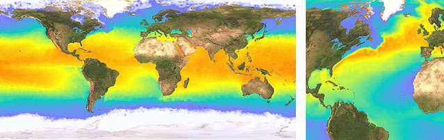
Some satellites measure physical parameters, such as the temperature of the Earth's surface, at regular intervals. We can display this type of satellite observation, or climate data such as rainfall, using an artificial colour map (psuedo-colour). The images above show satellite-derived sea surface temperature, combined with our natural-colour satellite map on the land. We can display a sequence of climate data as an animation to show seasonal and year-on-year changes.
We can also apply specialist analysis techniques to a data sequence - to show, for instance, the ocean temperature relative to the latitudinal average (above right). This map highlights warm ocean currents such as the Gulf Stream (red) and cold currents such as the Labrador Current (blue).
Data source: ERS-ATSR 10 day SST, courtesy of UCL/MSSL